Oak + Fort Case Study
Oak + Fort is a fashion brand known for providing affordable, minimalist, luxury fashion. This project was completed in 2023, and is something I took on as a passion project. The goal was to re-design Oak + Fort’s website to better reflect the brand.
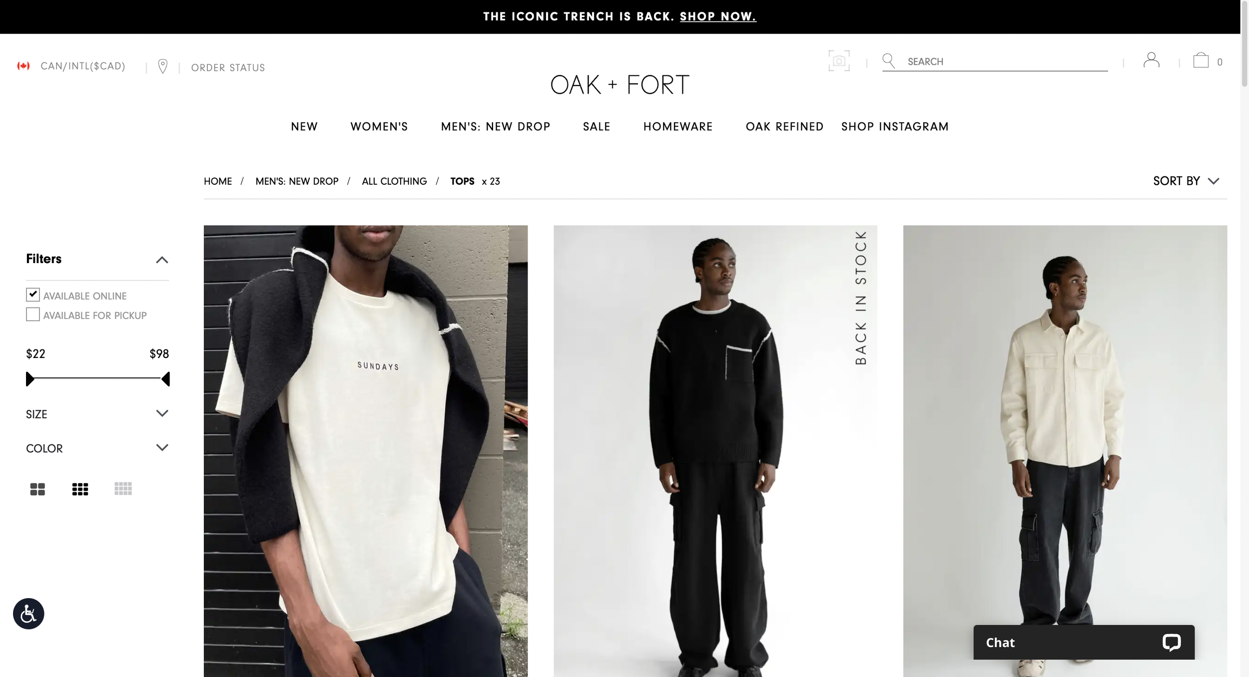
Pain Points
With this project, the goal was to improve a few areas:
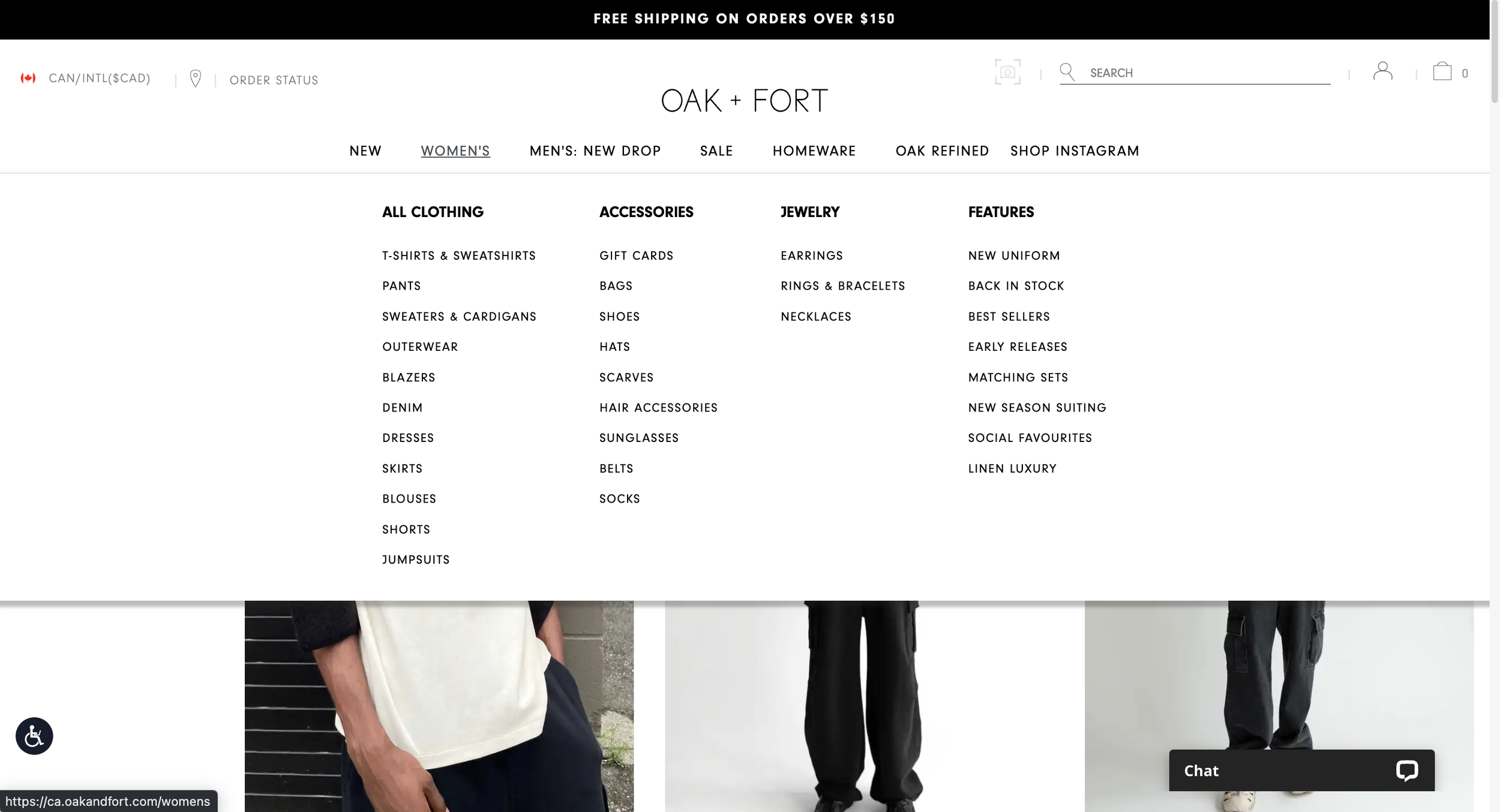
Inefficiency — the user flow is cluttered and includes unnecessary functions, increasing friction for users and “cheapens” the feel of the website.
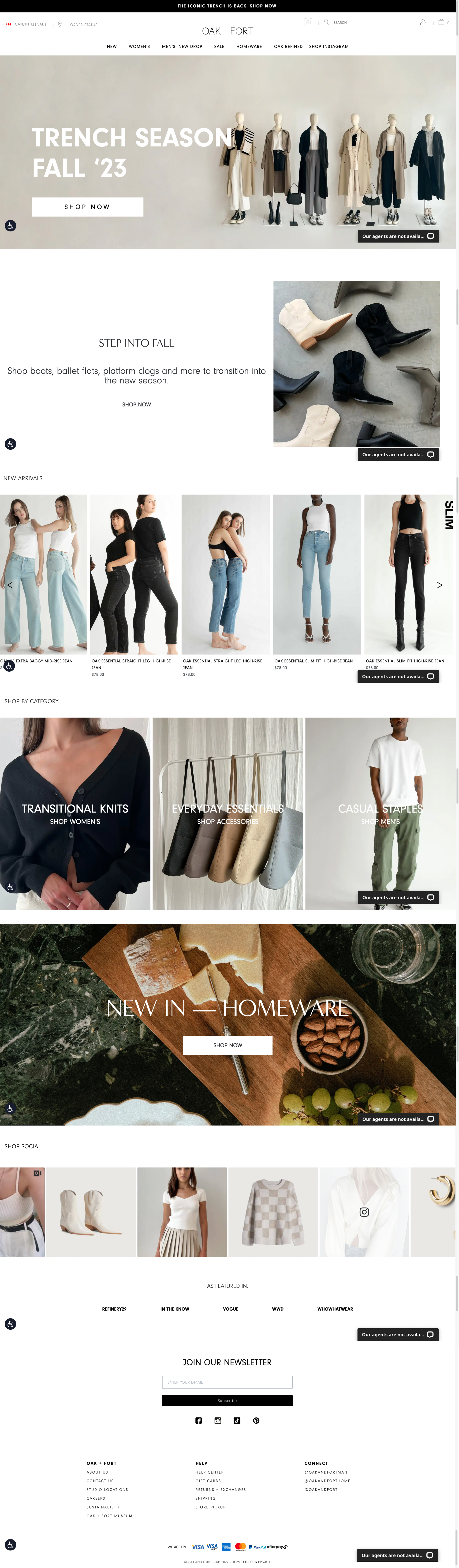
Shop by Category — already achievable by scrubbing via the header.
Chat Agent Button — takes up space, and does little to remove any interaction-level barriers as users who need this function will look elsewhere in more intuitive areas, such as in a Contact Us section.
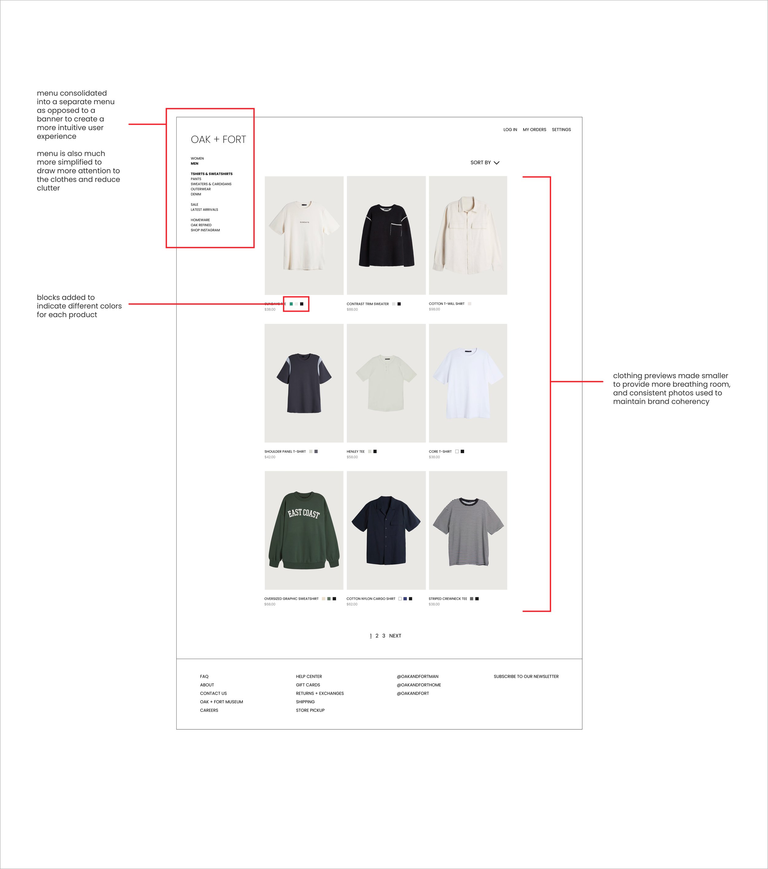
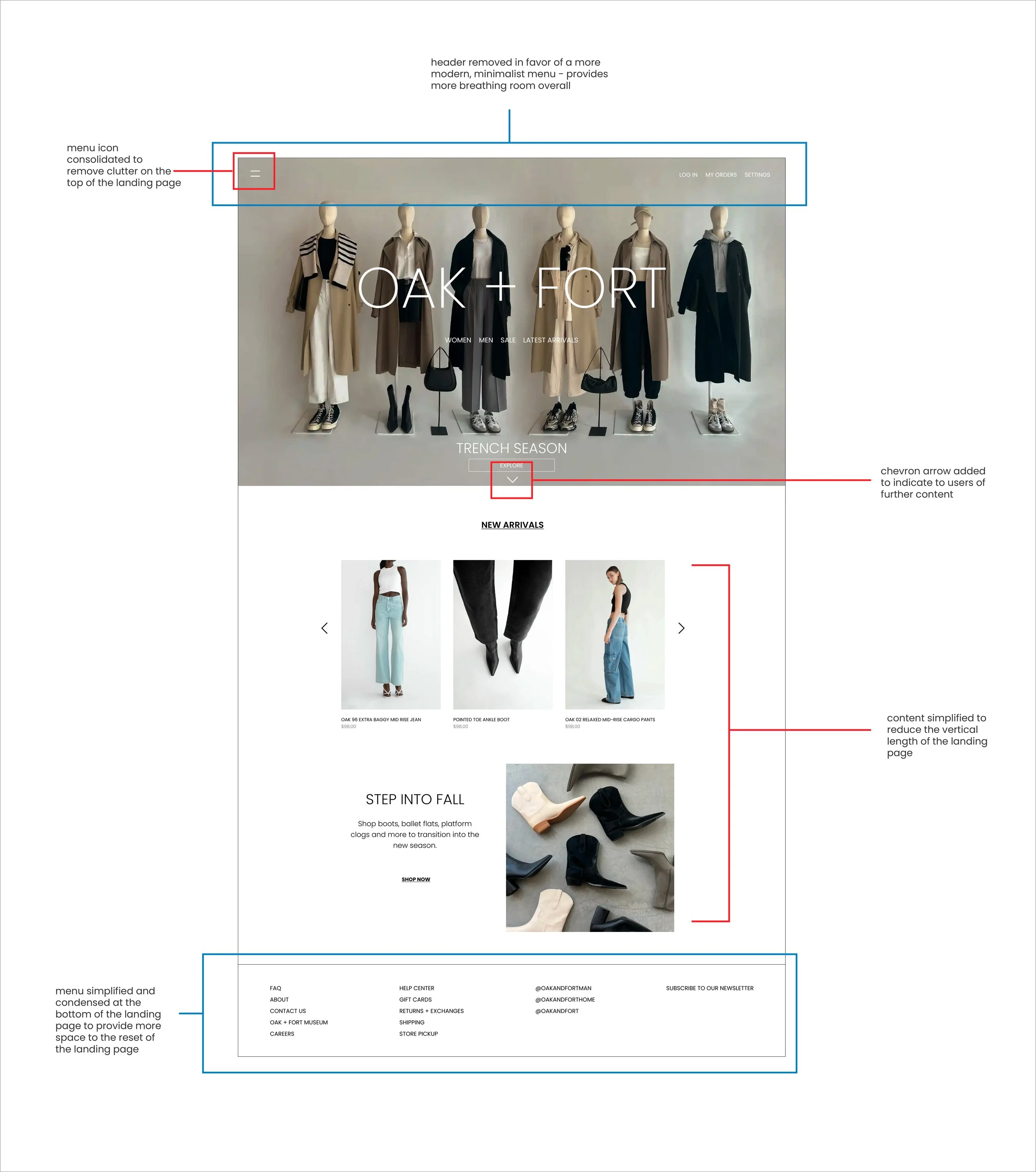
Website branding (layout, clickstream) does not feel representative of Oak + Fort’s mission statement of “luxury.”
The Vision
I began by taking a look at a few competitors of Oak + Fort at varying price points of lower, mid-range, and high-end. H&M, COS, and Acne Studios were the brands I selected respectively for these price points.
A common trend that I observed is that the higher price points brands such as COS or Acne Studios gravitated towards a more minimalist, editorial-style, whereas H&M’s website strayed from this style.
As such, I wanted Oak + Fort’s website to take on that direction to better represent luxury both visually and through it’s user experience.
Workflow
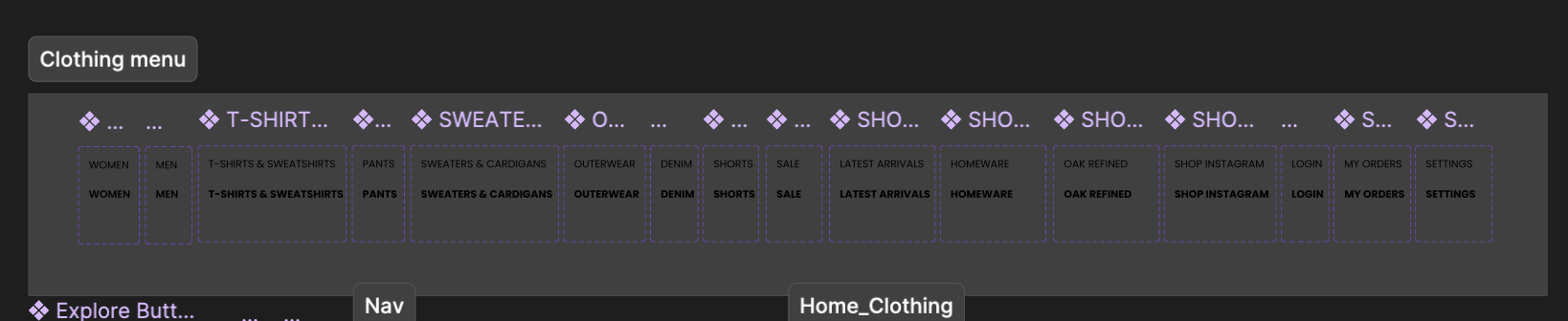
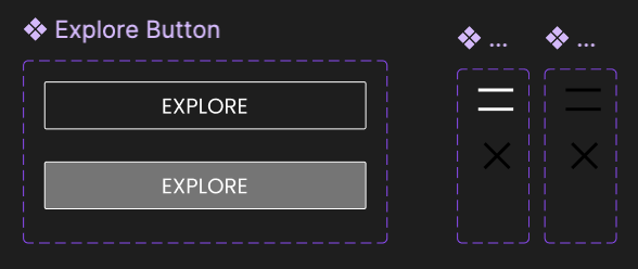
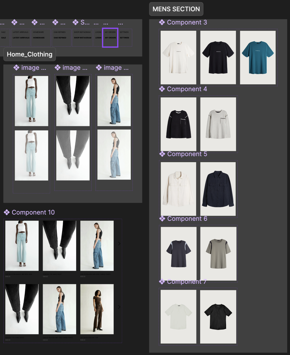
All work was done in Figma, with imagery taken from Oak + Fort’s website. Components and variables were used for final prototyping purposes.